Our sense of vision allows us to perceive the world in images, motion and colour. We use information from our vision to move around and interact with objects and environments. The effective design of any product or environment should take the range of human visual capabilities into account.
On this page:
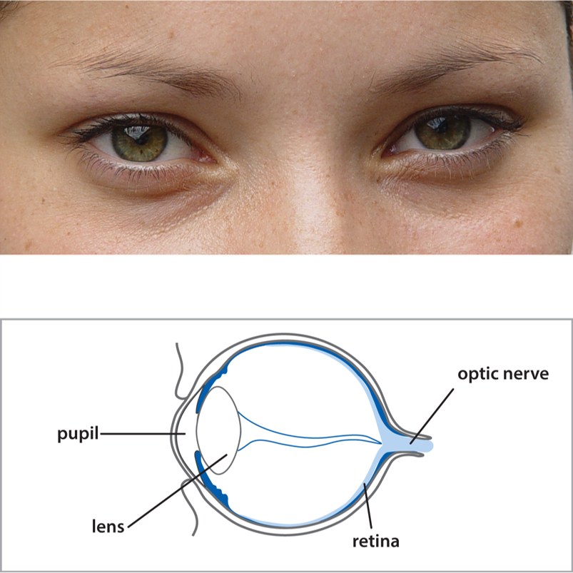
The shape and structure of eyes.
Important note
This page highlights factors to consider when designing or assessing products, and provides some useful suggestions, but the advice should be followed within the context of an Inclusive design process.
Introduction
Vision is used to perceive graphical, textual, colour and shape information, and thus is extremely important for product interaction.
Vision involves different parts of the eye and nervous system working together. Problems with any of these can make aspects of vision more difficult or impossible. Common conditions such as short and long-sightedness can often be corrected by glasses. However, as people age, their eye muscles weaken and the lens becomes stiffer. This means that the eye can no longer adapt to focus on objects at different distances.
Because of ageing and various eye conditions, the structure and function of the eye can also deteriorate, which can result in blurry vision, reduced contrast sensitivity, and loss of vision at the centre or the outskirts of our vision. Colour blindness is another condition, which can make it difficult or impossible to distinguish between certain colours.
Some general visual factors to consider when designing or assessing products are to:
- Use multiple media. Think about assisting those with vision impairments by supplementing information through auditory or tactile means. However, be careful not to overload people with information and remember that a significant number of people with vision problems also have difficulties with hearing (1.8% of the GB population).
- Use a simulator. Think about minimising exclusion by ensuring the design remains usable with a vision impairment simulator.
More detailed advice on specific aspects of visual design is given below.
Think about minimising exclusion by ensuring the design remains usable with a vision impairment simulator.
Size and shape of visual elements
Various vision conditions can cause blurry vision and loss of visual acuity. This can make it difficult to see fine detail.
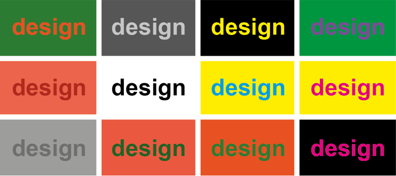
Text and other graphical elements need to be large enough to be seen clearly without being so large that it is difficult to see the whole picture or sentence at one time.
However, it is not just overall size that determines how clear an object is. Users need to be able to distinguish the features or parts of the object. For example, recognising a letter involves distinguishing the strokes in a letter. This is affected by factors such as line thickness and spacing.
Important things to consider in design are to:
- Consider size. Ensure visual elements (e.g. text, graphics) are big enough to be seen without bringing the product close to the eyes.
- Consider shape. Make the shapes of elements distinctive and make sure they have enough space around them.
- Choose fonts carefully. Avoid italicised or decorative font styles for blocks of text or signs. Note that common practice is to use a serif font for large blocks of text, and a sans serif font for signs, labels or headings.
- Consider symbol clarity. Carefully consider the line thickness, line spacing and overall size when designing graphical symbols or logos.
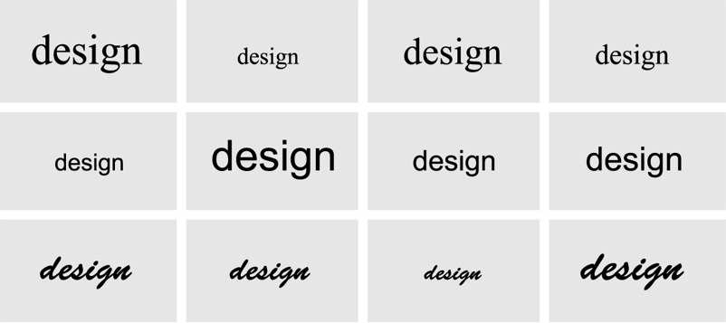
Different combinations of font size and style - the top line is a serif font, the middle line a sans serif font and the bottom line a decorative font.
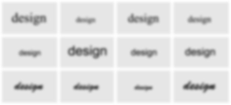
The same images viewed with reduced visual clarity.
Contrast
Contrast sensitivity is the ability to perceive the difference in brightness between a foreground and background colour. It is related to the size, distance and illumination of the object to be detected. Maximum contrast occurs with white on black or vice versa.
Contrast sensitivity is important for activities such as detecting and reading text, moving around in the environment, and detecting the outlines of buildings, roads and pavements.
It is important to consider the contrast levels used in designs. Low contrast text will be more difficult to discriminate than high contrast text. In addition, controls on products need to be of sufficient contrast against product chassis to be easily detected.
The diagrams opposite show some different foreground and background colours for text and the corresponding images viewed with a reduced brightness contrast. Note how a sharp colour distinction helps to discriminate between the foreground and background when the brightness contrast is reduced.
Important things to consider in design are to:
- Consider contrast of objects. Ensure that important objects and features have sufficient contrast with their environment, e.g. adding high contrast strips to the edges of steps can make them much easier to detect and thus reduce falls.
- Consider contrast of elements. Ensure that graphical and textual elements have sufficient contrast with their background.
- Choose backgrounds carefully. Be particularly careful with patterned or picture backgrounds as they can interfere with the legibility of text or other graphical elements.
In order to determine which colour combinations are most effective, try viewing this image at various distances and squinting as you read it.
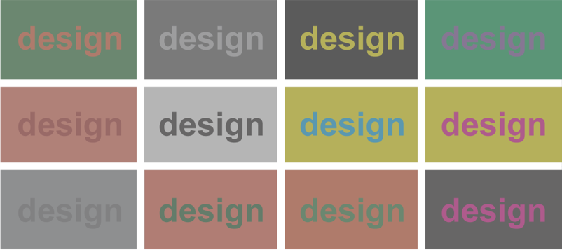
The same images viewed with reduced brightness contrast.
Colour
Colour conveys information about the physical world. It is detected by cells in the eye that function best in relatively bright light. Thus colours are harder to discriminate in low lighting.
Some people are affected by a loss of colour discrimination (or colour blindness). They can still perceive colour, but cannot effectively distinguish between particular colours. The most common form of colour blindness is red-green colour blindness, which affects the ability to distinguish between colours from red to green in the colour spectrum.
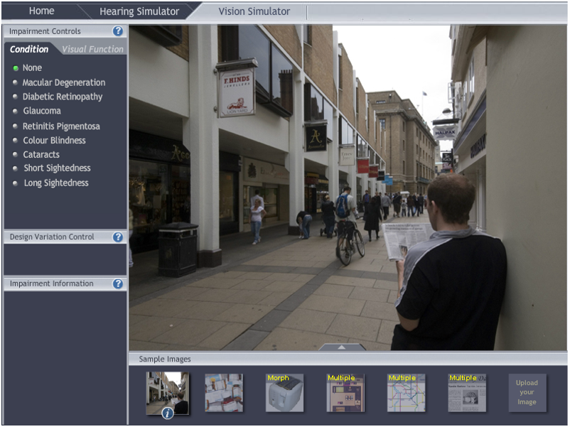
This can make interaction with products difficult if colour alone is used to provide information. You can check whether your own images or interfaces remain effective with simulated colour blindness using this toolkit’s Impairment simulator software, which is freely available.
Important things to consider in design are to:
- Supplement colour. Think about using colours to help convey information but ensure they are supplemented by presenting the information in alternative ways (e.g. use shapes and text).
- Ensure sufficient contrast Consider using colour contrast to help make things stand out, but ensure there is also sufficient brightness contrast
- Check in greyscale. Check that a product remains usable when its image is converted to greyscale.
The Colour Universal Design website describes colour blindness in much more detail, and also includes a colour palette set that is unambiguous and balanced for all people, irrespective of any colour blindness.

To determine which colour combinations are most effective, try viewing this image at various distances and squinting as you read it.
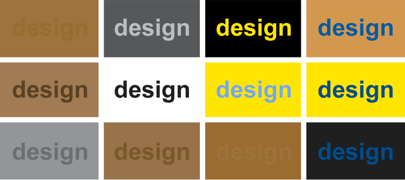
The same images viewed with a simulated red-green colour blindness. Note that foreground / background colours with similar brightness contrasts can disappear when viewed by someone with colour blindness.
These images were produced using this toolkit’s Impairment simulator software.
Layout
Layout is an important aspect of a design and can have a large impact on its visual accessibility. It is particularly important when considering issues to do with reduced visual field.
Someone’s visual field refers to area that they can see without moving their eyes. With increasing age and various eye conditions, the usable visual field can change. This loss can either start from the centre of the visual field (central field loss) or from the outer edge of the visual field (peripheral field loss).
The central visual field is used for focusing and perceiving detail. When it is obscured, tasks that require perception of detail (such as reading) become very difficult. People generally adapt to compensate for this loss and attempt to use the peripheral visual field. However, this part of the retina is less sensitive, resulting in a loss of acuity and contrast sensitivity. The same guidance given for acuity and contrast will help users with central field loss.
A reduction in the usable peripheral visual field results in tunnel vision and can affect mobility. The upper images opposite show a rail ticket machine with widely spaced controls. This can result in problems when viewed with a peripheral loss. The lower images show a proposed redesign of the same machine where the continuity between the required action areas has been emphasised, resulting in a more usable interface.
Important things to consider in design are to:
- Consider visual field loss. Arrange the design so that it remains visible and usable for those who have some loss of visual field.
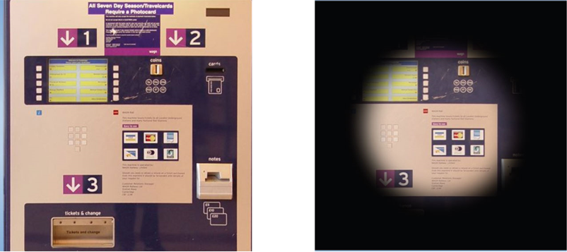
A ticket machine that has poor clarity of layout viewed with normal vision, and the same ticket machine viewed with poor peripheral vision.
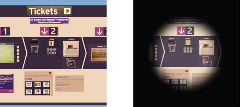
This shows a redesigned layout for the same machine, which enables the overall layout to be perceived, even with a peripheral vision loss.
Lighting and glare
The context in which a product is used can affect its visual usability.
The level of ambient illumination impacts on the ability to perceive visual detail. The positioning of the light source in relation to the user and the product is also important. For example, users may have difficulty reading the text on the back of a television, or reading a road sign whilst facing the sun.
Glare can also cause significant difficulties when reflective surfaces such as a screen are viewed from a certain angle relative to the light source. Consideration of reflectivity, distance and viewing angle is particularly significant when the position of the product or user is fixed or constrained, such as when viewing a road-sign.
Important things to consider in design are to:
- Consider lighting conditions. Consider the likely lighting conditions when choosing the size, font and contrast of text and graphics
- Enable users to control lighting. Contemplate enabling users to control the intensity, position, and angle of lighting sources to best suit their own vision ability and the task.
- Consider glare. Consider potential issues with glare, based on: the surface finish of the item being looked at, the intensity of the light source, and the angle of view.
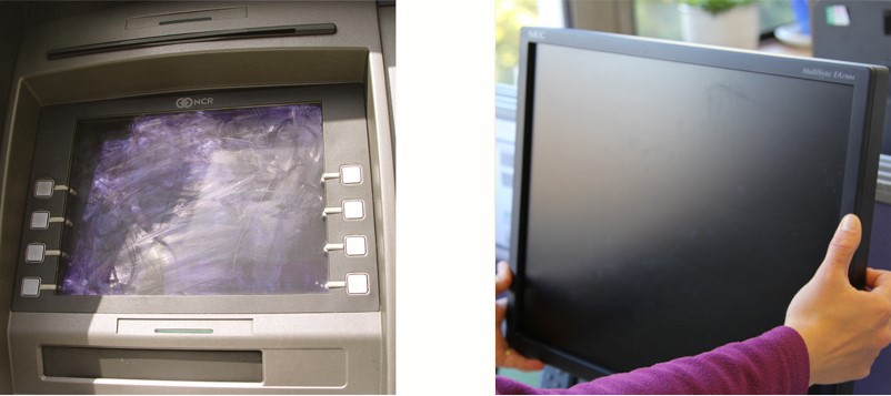
Tilt adjustment for a screen helps to minimise problems with viewing angle and glare for a range of users.
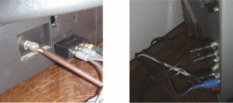
Viewing the back of equipment highlights difficulties that can arise as a result of the context of use.
Vision simulations
Vision simulations provide one way to understand the impact of vision conditions on usability. They demonstrate the effects of various vision conditions and impairments. Software simulators show the effects of these conditions on photographs and other images, while physical simulators can be worn while interacting with products and prototypes. It is a good idea to try out designs with a simulation to ensure that they remain usable with various vision impairments.
The following are just a few examples of the vision simulations available:
- The Impairment simulator software in this toolkit simulates a range of vision impairments at different degrees of severity.
- The Cambridge Simulation Glasses are also available through this toolkit. These wearable glasses demonstrate the impact of a range of visual acuity losses.
- aDesigner simulates different levels of short sightedness, lens transparency and colour blindness. It also checks vision aspects of web accessibility. Is it available for free download.
- Many blind and visually impaired people use screen readers to read out the contents of webpages. The WebAIM screenreader simulation simulates the use of a screenreader on an example website.
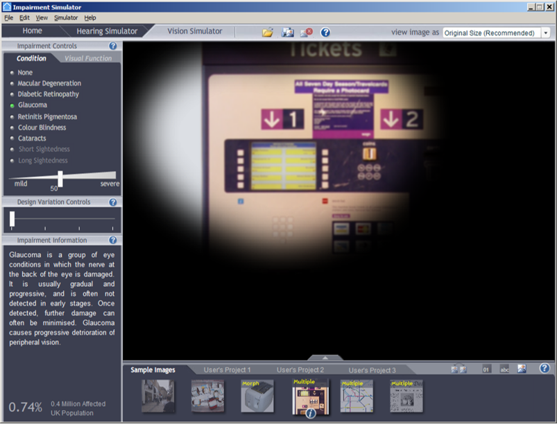
Impairment simulator software, showing the effect of moderate glaucoma.
Population statistics
The graph on the right shows the proportion of the British adult population living in private households who would be excluded by tasks with the following levels of vision demand:
- No demand: No need to see anything
- Newspaper headline: As visually clear as a newspaper headline
- Large print: As visually clear as large print text
- Newsprint: As visually clear as ordinary newspaper print
This graph was derived from the Disability Follow-Up to the 1996/97 Family Resources Survey, see the page on Assessing demand and exclusion for details. At the time of the survey, the GB adult population living in private households was 43.3 million.
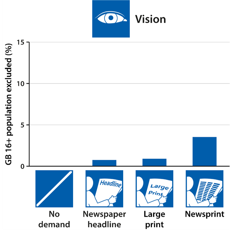
The proportion of the British adult population excluded by tasks with various levels of vision demand.
Further information
Statistics on the numbers of people in Great Britain with different levels of vision capability can be found by using the Exclusion Calculator at calc.inclusivedesigntoolkit.com.
Further information on vision loss and how to address it in design can be found in the following sources:
- The RNIB Knowledge and Research Hub website provides information on sight loss and the issues affecting blind and partially sighted people
- The WebMD website has a section on Understanding vision problems
- A report by Action for Blind People: Making it clear: Guidelines to producing printed material for people who are blind or partially sighted (pdf document) provides advice on creating accessible print materials
- A booklet by the RNIB (2006): ‘See It Right: Making information accessible for people with sight problems’ provides some further guidance (ISBN: 1858787041)


Statistics on the numbers of people in Great Britain with different levels of vision capability can be found by using the Exclusion Calculator at calc.inclusivedesigntoolkit.com.
Feedback
We would welcome your feedback on this page:
Privacy policy. If your feedback comments warrant follow-up communication, we will send you an email using the details you have provided. Feedback comments are anonymized and then stored on our file server. If you select the option to receive or contribute to the news bulletin, we will store your name and email address on our file server for the purposes of managing your subscription. You can unsubscribe and have your details deleted at any time, by using our Unsubscribe form. If you select the option to receive an activation code, we will store your name and email address on our fileserver indefinitely. This information will only be used to contact you for the specific purpose that you have indicated; it will not be shared. We use this personal information with your consent, which you can withdraw at any time.
Read more about how we use your personal data. Any e-mails that are sent or received are stored on our mail server for up to 24 months.