Welcome to the 7th edition of the Inclusive Design Toolkit news bulletin from the Cambridge Engineering Design Centre. The bulletin showcases people’s achievements with the tools from this website, and other interesting applications of inclusive design.
If you would like to receive this bulletin on a regular basis, or contribute to it, then please fill in the feedback form at the bottom of this page.
On this page:
Flâneuse mobile seats
Sony Accessibility Lab helps build empathy
Sony’s Accessibility Empathy Lab used the Cambridge University simulation gloves and glasses to engage employees and increase awareness of the issues around disability and inclusivity. The lab also demonstrates how issues can be overcome through the use of technology and Inclusive Design.
The lab started in Sept 2022 and is now rolling out across key Sony European sites, for all employees from senior management level and below.
“
The use of simulation devices enabled a deeper understanding of the issues being faced, and helped us drive greater engagement and interest in this important area that’s a key part of our Sony Europe Sustainability strategy. ”
Sony produced a one minute video that showcases the accessibility labs, and how Sony helps access and equality for those with disabilities.

Cambridge University simulation gloves and glasses provide insight into some issues faced by those with disabilities
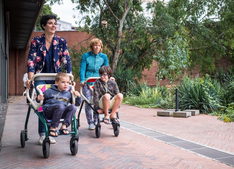
Flâneuse mobile seat allows longer exhibition visits
Toulouse based start-up E-Hé designed the flâneuse, which is a mobile seat that helps exhibition visitors walk, rest, and transport equipment and children.
Working with users and institute employees, E-Hé identified that fatigue and discomfort were affecting a wide range of visitors, so they designed the flâneuse to serve a wider audience than traditional mobility devices.
“
These mobility devices encourage a change in perception, increasing the extent that all audiences are welcomed. ”
80% of flâneuse users said that it allowed them to stay longer on site, and 84% of staff said they now felt more comfortable welcoming people with mobility difficulties.
Flâneuse mobile seats are suitable for a wide range of users, as strollers, walkers, and equipment carriers
Art exhibition shows effects of sight loss
Artist Ruth Fones has been working with the sight loss charity Outlookers to develop paintings based on various sight loss conditions.
Volunteers were interviewed by Ruth and asked to describe their vision. The impairments covered included macular degeneration, glaucoma, retinitis pigmentosa, and long sightedness.
Ruth used photographic techniques and the Cambridge Impairment Simulation Software to create digital images that simulated the different visual impairments, and then use these as a basis for the paintings. Each painting focused a particular daily frustration, like accessing public transport.
The project culminated in an Art and Vision exhibition in Valli Opticians, West Yorkshire, which was seen by an estimated 1000+ visitors. Attendees commented that it really helped raise awareness of different sight loss conditions.
Ruth intends to continue developing further artworks, and has received worldwide enquiries for further exhibitions.
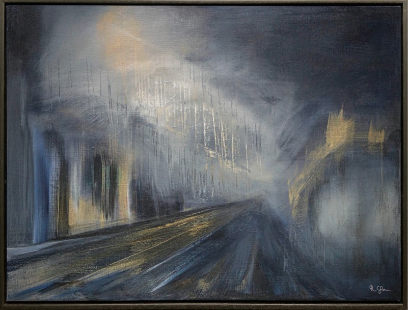
The Art and Vision exhibition offered an insight into life with particular sight loss conditions. This particular painting highlights the frustration associated with navigating a street at night.
Unilever adopts new formula for assessing contrast
Since 2008, the Web Content Accessibility Guidelines (WCAG 2.1) have implied that the legibility of text on websites can be predicted according to the contrast ratio of the brightest colour compared to the darkest colour. If all other text parameters are equal, then bigger ratios mean the text ought to be more legible.
However, around 2019, several articles (like this article) found that the guidelines sometimes contradicted user preferences for text on colour backgrounds. For example, most users found white text on an orange background to be more legible than black text, yet the white text failed WCAG contrast guidelines and the black text passed.
In fact, orange isn’t the only colour background where white text seems to fail when it ought to pass. The image opposite shows five different colour backgrounds. For each of these, most users report that the white text is more legible, yet the white text fails WCAG contrast guidelines and the black text passes.
Since January 2022, the Accessible Perceptual Contrast Algorithm (APCA) now proposes that the legibility of text on websites is better predicted by considering the perceived difference in the lightness of the text and the background, rather than the ratio. This difference is named the ‘Lightness Contrast’ (Lc).
Unilever's brands have long wanted to use white text on coloured backgrounds in their communications, but were discouraged from doing so because the contrast ratio would fail WCAG guidelines. The APCA formula will still fail white text on pale colour backgrounds, but it will pass a much greater range of white on colour backgrounds than the contrast ratio. This isn't because the APCA formula is less stringent, it's just because it's a more accurate model of human perception.
“
Unilever is now adopting the APCA algorithm to ensure newly created assets are visually accessible, and continues to partner with Cambridge University to explore further ways to improve people’s experiences. ”
This article on contrast by Sam Waller provides a more detailed investigation of black and white text on coloured backgrounds, and includes a footnote on the impact of colour impairments.
An early working draft of WCAG 3 (published December 2021) proposes using the new APCA method for calculating contrast.
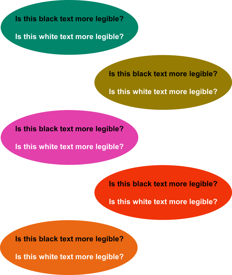
For all of these colour combinations, the WCAG contrast ratio passes the black text but fails the white text, but the APCA algorithm passes the white text and fails the black text.
To find out which is more legible for you, increase your viewing distance until one of the lines of text becomes impossible to read.
This article on contrast by Sam Waller provides a more detailed investigation of black and white text on coloured backgrounds.
Accessible game uses entertainment to teach
Amaury Dudcoschi Junior at the Federal University of Paraná, Brazil, developed an accessible version of the Senet game, with the aim of breaking down the barriers to entertainment for the visually impaired. The game was designed by two blind users, with support from the Inclusive Design Toolkit. For a demonstration see https://www.youtube.com/watch?v=Ey7Svr8rdpc&t=134s.
The board game was included within basic computer training at UNINTER university, to encourage employing people with disabilities. The game was also included within the design curriculum at Federal University of Paraná, to encourage future professionals to develop accessible digital products.
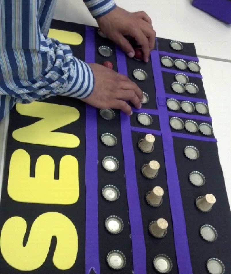
This accessible version of the Senet game is used to encourage future professionals to develop accessible digital products.
Feedback
We would welcome your feedback on this page:
Privacy policy. If your feedback comments warrant follow-up communication, we will send you an email using the details you have provided. Feedback comments are anonymized and then stored on our file server. If you select the option to receive or contribute to the news bulletin, we will store your name and email address on our file server for the purposes of managing your subscription. You can unsubscribe and have your details deleted at any time, by using our Unsubscribe form. If you select the option to receive an activation code, we will store your name and email address on our fileserver indefinitely. This information will only be used to contact you for the specific purpose that you have indicated; it will not be shared. We use this personal information with your consent, which you can withdraw at any time.
Read more about how we use your personal data. Any e-mails that are sent or received are stored on our mail server for up to 24 months.