This example presentation has been created as a resource to help inclusive design practitioners or supporters to tell others about inclusive design. It includes an explanation of what inclusive design is (at the highest level), why inclusive design is increasingly important in society and why it is valuable for organisations to adopt inclusive design principles. It examines population diversity and changing demographics, and explains the commercial imperative for inclusive design, giving an example of the success that it can bring.
We would encourage you to use as many or as few of these slides as needed in your presentations. Notes have been created for each of the slides to help indicate the pitch that is intended to accompany the slides and images. A transcript to accompany the presentation is also provided lower down on this page.
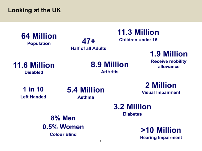
An example slide from the business case presentation, showing different aspects of diversity evident within the UK population.
Download
Download the business case presentation (MS PowerPoint 2003).
Transcript of this presentation
Welcome to the business case for inclusive design. Let’s look at the world around us in numbers. Today there are nearly 7,000 live languages in the world from a population of 6.6 billion. The gender or sex ratio is roughly 50/50 male to female. By 2050 there will be two billion people in the world over 60, in the same year the potential support ratio will be four to one — I’ll explain a bit more about that later. There are over 600 million people today with disabilities. One in four people have poor literacy. In 2007 for the first time more people lived in urban areas than rural areas, also there are one billion people living in slums today and there are four billion people who live on four dollars a day or less, yet interestingly, one in three people in the world have a GSM mobile phone today.
Let’s look at a country like the UK, the population is 60 million, of those over half the adults are over 47, there are 11 million children, there are 14 million grandparents. 10 million people in the UK are disabled, 2 million of those have visual impairments, there are 9 million people with hearing loss, there are 8.5 million with arthritis, 3.4 million with asthma, 1.5 million with diabetes, 8% of men and 0.4% of women are colour blind, and one in 10 people are left-handed, not being a disability, but just showing you how the population varies. So if we look at the world and we look at a country like the UK, what does that tell us about people?
It tells us this: it is normal to be different. And in terms of design, how do we respond to that difference?
Let’s look at British Standard BS 7000, Part 6, it says this about inclusive design: it says it’s the design of mainstream products and/or and services that are accessible to, and usable by, as many people as is reasonably possible, on a global basis in a wide variety of situations and to the greatest extent possible, without the need with special adaption or specialised design. We are very much talking here about every day products that are designed to be more inclusive for a wider range of that diverse population. However inclusive design does not imply that one product fits all. It does not replace the need for specialist products and services and we are not designing just for one particular need, we are trying to understand the complete diversity of needs in the population.
Now let’s look at a typical response to a product. With any product there’s a varying product experience for different people in the population and there will always be those who are excluded from using a particular product, they simply can’t use it for whatever reason. There are also significantly more people who will have difficulty using that product and as we move across that product experience there will be those that are frustrated with the product, and finally we reach those who actually find it easy to use. In a survey back in 2004 by Philips, they found this: two out of three Americans report having lost interest in a technology product because it seems too complex to set up or operate. What this shows us is that we are dealing with a majority issue here with many products today, so it’s not a minority issue, it’s very much a majority issue making those products easier to use for a wider range of people.
Let’s look at one product in particular, let’s take Microsoft Word, a product probably a lot of people use every day. In Word one there are 100 features, by Word 2003 there are over 1,500 features and Microsoft did some research about this, they asked people what they wanted in the next version of Office and nine out of 10 people wanted a feature that they already had, "they simply don’t know it’s there", to quote the Microsoft VP. You see, we are overloading with more and more features, with products, yet we need to understand basically what the need is and meet those needs. Back to the 2004 study by Philips, only 30% of the public believe in general that technology products are easy to use. So we have a real issue here for the general population that products have become too complex.
Here’s a nice simple example, the humble kettle. Now the story goes that actually the cordless Kettle was invented to benefit people with dexterity issues having difficulty with a cord here, moving towards a cordless design. But what we see is a product that is actually better for everybody and there are very few corded kettles now in the market. A nice simple but very powerful example of inclusive design.
Ok, let’s look back at the ageing issue that I talked about earlier when we looked at the numbers of the world and indeed in the UK. You see back in 1950, there were 200 million people worldwide over 65. By 2005 that figure had grown to 673 million, but look at the jump a hundred years on, in 2015, there will be estimated 2 billion people worldwide over 65, that’s a massive change in the demography of the world. And what does that mean, what actually happens to us as we age?
Here’s another graph, this is the percentage of people who have some kind of disability and you can see there’s a significant increase with age. And again, bear in mind that this is half the adult population, so again, we’re dealing with a majority, not a minority issue here, when we look at how the body changes with age. P/p>
There’s another big change with age as well and it’s something called the potential support ratio, I’ll explain what that is — it’s the number of people from 50 to 64, who can potentially support one person 65 plus, this is pure statistical understanding of the population and its structure in terms of age. The figure in 1950 was 12 to one, by 2000 that figure had come down to nine to one, by 2050, that figure comes down to four to one, that’s the figure for the whole world, in the developed world that figure comes down to two to one. So you can see not only is there a usability problem particularly with age, but there’s also problems of supporting people in the population using everyday products and services. Today living independently as we get older is an aspiration, in the future it will become an imperative, that’s a real opportunity for providing products and services that meet that significant need as the population changes.
It’s not all bad news though, look at this, this is time or income on the axis here and this is age here, what we see is the most available free time and disposable income actually peaks around age 65, yet many companies target their marketing at a much younger age group, yet there is a real opportunity here with what is often called the grey pound or in America, the silver dollar. So things really are about the product response to the ageing process, rather than the ageing process itself, which is important to bear in mind when we’re designing.
Let’s look at the actual design process and the question is can you afford not to respond to that need, to respond to the diversity of that population? This is what happens to the cost of change as we go through a typical product lifecycle: at the concept change the cost is a unit of one, as we move through the design process, as we get further into the design and build and testing etc., the cost of change dramatically increases, so if we understand that need well at the beginning of the process and make good design choices and reduce the need for changes later on, then effectively we save money and get a product to market that much better meets the needs of that market. So can you afford not to do it? The answer is simply is no.
Now let’s look at some other examples to try and bring this out and draw this out, let’s take the example of the spectacle or glasses. In the UK in the 1930s the NHS classified spectacles as a medical appliance, and their wearers as patients. As we move forward to today, things have completely changed, we’ve moved from a model of humiliation with those devices to one of aspiration. So if you look at glasses today they’ve become a fashion item, to the extent that some brands, some particular designs, that 20% of them are bought have non-prescription lenses in them, they are purely a fashion accessory. A great example of inclusive design, bringing it into the mainstream and making it acceptable.
Let’s look at a few more examples, simple examples, but good examples. Here is a tap with an adapted lever on to improve the purchase on it, so it makes it easier to use for someone with dexterity issues and grip issues, but it’s clearly horrible and ugly in use. Design it from the outset to meet that need and we end up with a better product for everybody, stylish to look at and easier to use, with a lever handle. Here is a disabled loo, hardly a picture that you would want to hang on your wall, but let’s look at how that could be different, here we have a suspended loo, and ok this is not meeting all the needs here, but it’s showing some significant differences from a standard installation. By hanging this loo on the wall it creates more space visually, so it’s more aesthetically pleasing and it makes it easy to clean, but the significant thing is that if installed correctly the height can be raised to meet the needs of an older user who has difficulty sitting down and getting back off. So again, ways of making it more inclusive, yet more aesthetically pleasing and more desirable as a product. Something really simple, a measuring jug, now typically with a jug like this when you fill it with fluid, you have to bend down to look at the level you are trying to achieve for a particular recipe. Now here’s a different approach, here is a horseshoe in the design of the jug, which means you can see it from different angles and even look down on the jug and see what the level is, making it much easier for everybody to use. Let’s take a more complex product like a mobile phone. Here’s a possible response to the need particularly for older users, a simple three button design, yet it’s clearly different from mainstream products and can stigmatise the user. Here’s a different response, a Japanese phone here called the Raku Raku, which means easy easy in English. This is a contemporary, stylish design, yet when you open it out in its clamshell form, it’s fundamentally easier to use for the older users, and it doesn’t stigmatise them and it’s something they can blend in with yet meets their needs as an older user and there are many other examples of good inclusive design.
And finally to finish, remember this: good design costs, but bad design costs more.
Feedback
We would welcome your feedback on this page:
Privacy policy. If your feedback comments warrant follow-up communication, we will send you an email using the details you have provided. Feedback comments are anonymized and then stored on our file server. If you select the option to receive or contribute to the news bulletin, we will store your name and email address on our file server for the purposes of managing your subscription. You can unsubscribe and have your details deleted at any time, by using our Unsubscribe form. If you select the option to receive an activation code, we will store your name and email address on our fileserver indefinitely. This information will only be used to contact you for the specific purpose that you have indicated; it will not be shared. We use this personal information with your consent, which you can withdraw at any time.
Read more about how we use your personal data. Any e-mails that are sent or received are stored on our mail server for up to 24 months.